The Digital Interface
Discover More:
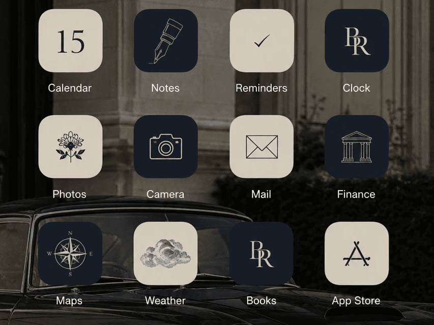
How to Craft a Timeless Digital Interface
By Blackthorne & Rowe | The Sartorial Archives
“Digital design, like fine tailoring, achieves perfection not when there is nothing left to add, but when there is nothing left to take away.”
We dedicate weeks to curating our wardrobes and physical style—the weight of tailored wool, the texture of handmade ceramics, and the warm illumination of a quiet room. Yet, we routinely unlock devices running default, brightly saturated interfaces designed for mass consumption rather than coherent style.
To achieve a timeless 'old money' lifestyle requires extending that same level of curation to your digital life. Your smartphone and laptop should not look like corporate office supplies; they should feel like a natural piece of luxury living.
This guide breaks down the core principles of design across three distinct digital domains:
I. Colour Theory & Textured Wallpapers
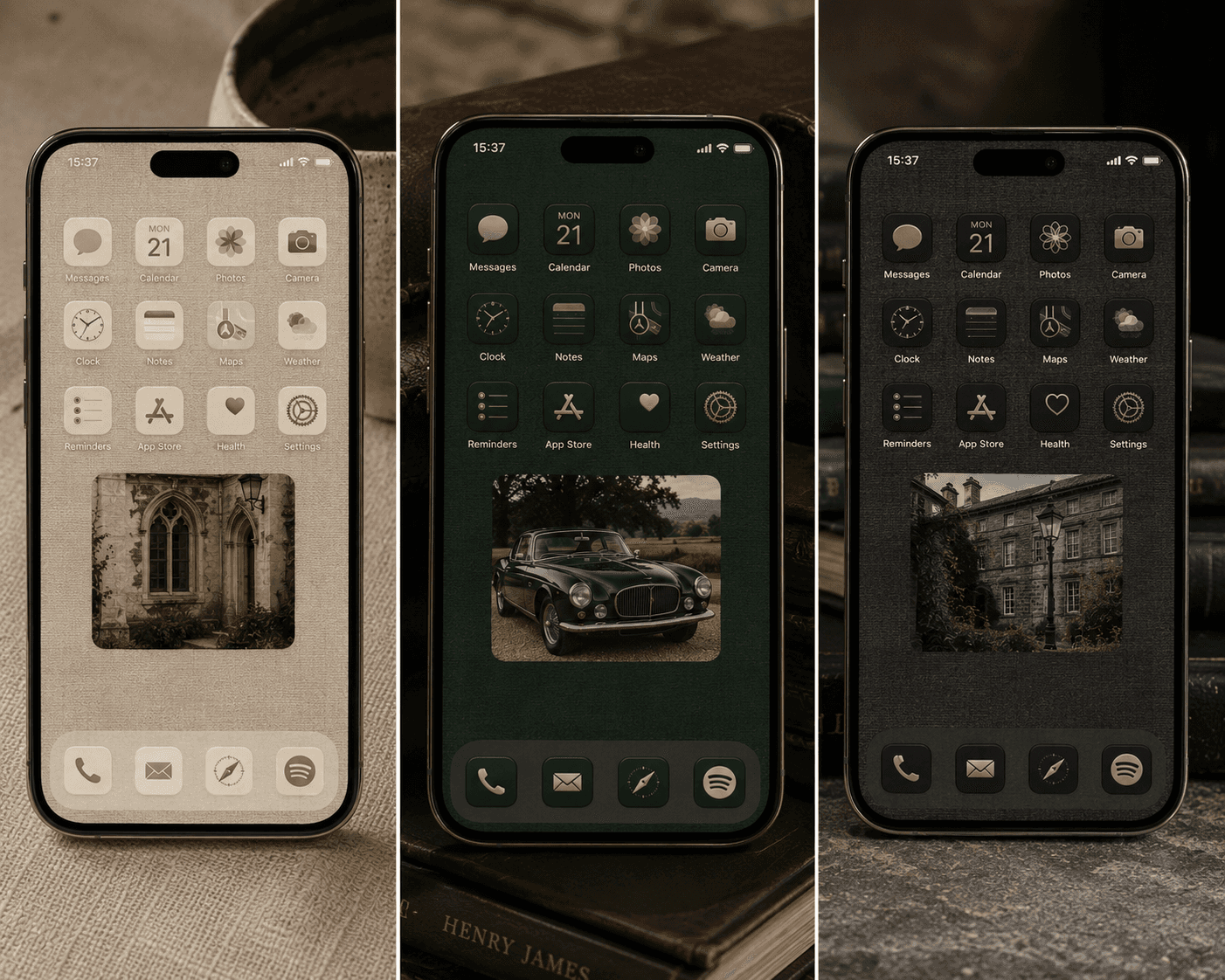
The foundational mistake in device customisation is selecting a backdrop that is overly complex or excessively vibrant. A background should function like a gallery wall—muted, structural, and designed to allow functional elements to sit comfortably above it.
The Regional Palette
The Warm European Cream: Replaces harsh, backlit whites with the soft, reflective tone of unbleached plaster or limestone. This shade reduces eye strain and establishes a warm, ambient canvas.
The British Racing Green: A deep, highly saturated shade borrowed from heritage motoring and classic library interiors. It works exceptionally well as a low-light dark mode alternative to stark black.
The Matte Charcoal: A desaturated slate tone that provides high contrast for typography while avoiding the digital flatness of true black.
Sourcing The Right Textures
Treat wallpaper selection like sourcing natural textiles. Look for macro photography featuring physical, organic surfaces rather than digital gradients:
Natural Linen: High-density weaves provide a subtle micro-texture that breaks up flat digital glass.
Lime Wash Plaster: Offers a matte, slightly varied tonal depth that mimics architectural walls.
Woven Slate and Charcoal Felt: Provides a dark, structural foundation for minimal icons.
If you are looking to curate the perfect old money iPhone wallpaper for your own digital project, explore our guide, with high quality wallpapers that you can use to improve your home screen here.
II. Typography & Layout Architecture Editorial
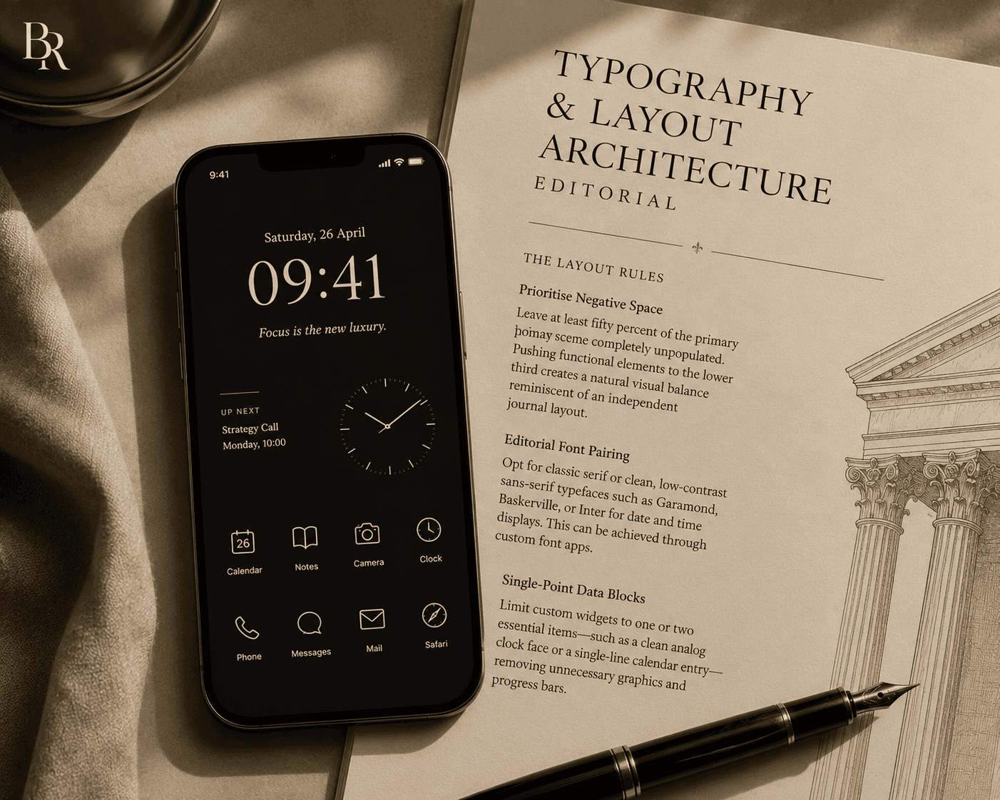
Standard mobile interfaces prioritise high icon density and bright notification badges. Applying print publication principles transforms a chaotic grid into a structured, editorial layout.
The Layout Rules
Prioritise Negative Space: Leave at least fifty percent of the primary home screen completely unpopulated. Pushing functional elements to the lower third creates a natural visual balance reminiscent of an independent journal layout.
Editorial Font Pairing: Opt for classic serif or clean, low-contrast sans-serif typefaces such as Garamond, Baskerville, or Inter for date and time displays. This can be achieved through custom font apps such as Fontmaker (iOS) or Font Maker: Create Custom Font (Android).
Single-Point Data Blocks: Limit custom widgets to one or two essential items—such as a clean analog clock face or a single-line calendar entry—removing unnecessary graphics and progress bars.
III. Monochromatic Iconography & System Curation
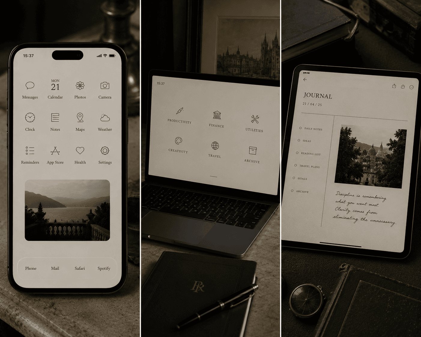
Uncurated application icons feature competing brand colours that break visual harmony the moment a device is unlocked. Unifying these elements under a singular colour system restores visual order.
Application Curation Framework
The Monochromatic Line Set: Render application glyphs in a single, unified shade—such as deep charcoal line art over an alabaster background.
Text-Based Labels: Replace standard logos with simple, typeset labels for daily applications, such as substituting a bright social media icon with a small, serif label reading Messages or Journal.
Primary Screen Isolation: Store secondary applications inside systemic drawers or folders, keeping only essential daily utilities on the primary interface.
IV. Digital Toolsets & Hardware Curation
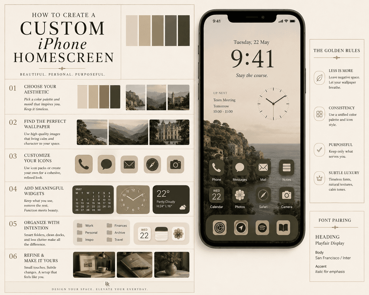
Executing a seamless, minimal digital setup relies on utilizing specific layout engines, minimalist software, and tactile hardware accessories.
Layout Engines and Customisation
Tools like Widgetsmith and Widgy allow for precise, layer-based layout design. They give you complete control over grid alignment, font importing, and background opacity to build modules that mimic high-end editorial print layouts.
Minimalist Software Interfaces
Android launchers such as Niagara Launcher and Minimalist Phone replace chaotic, colourful app grids with fluid, text-based vertical lists. They strip away visual noise and force an intentional interaction with your device.
Touch Hardware and Accessories
Brands like Native Union elevate physical tech utilities by crafting charging docks, cables, and sleeves out of weighted slate, raw metals, and woven fabrics. To completely bridge the gap between analog and digital, devices like the reMarkable paper tablet use glare-free e-ink technology to replicate the physical drag and texture of writing on classic paper.
V. Conclusion: The Quiet Digital Space
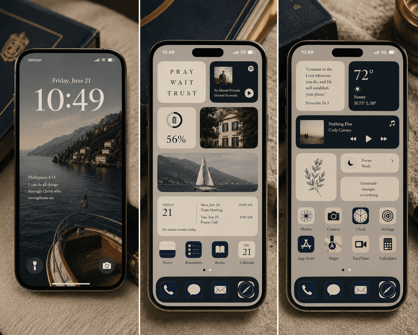
Redesigning a digital interface is not merely an exercise in visual styling; It is a practical method for reducing daily distraction. By applying the same principles of balance, local material palettes, and timeless typography that govern physical architecture to our screens, we create digital environments that feel deliberate, calm, and permanently refined.
Join the Digital Archive
At Blackthorne & Rowe , we curate guides on classical living, sartorial archives, and refined design principles. Explore the Collection: Visit our digital library for complete interface blueprints, wallpaper palettes, and editorial guides.
Continue Through the Archive.


