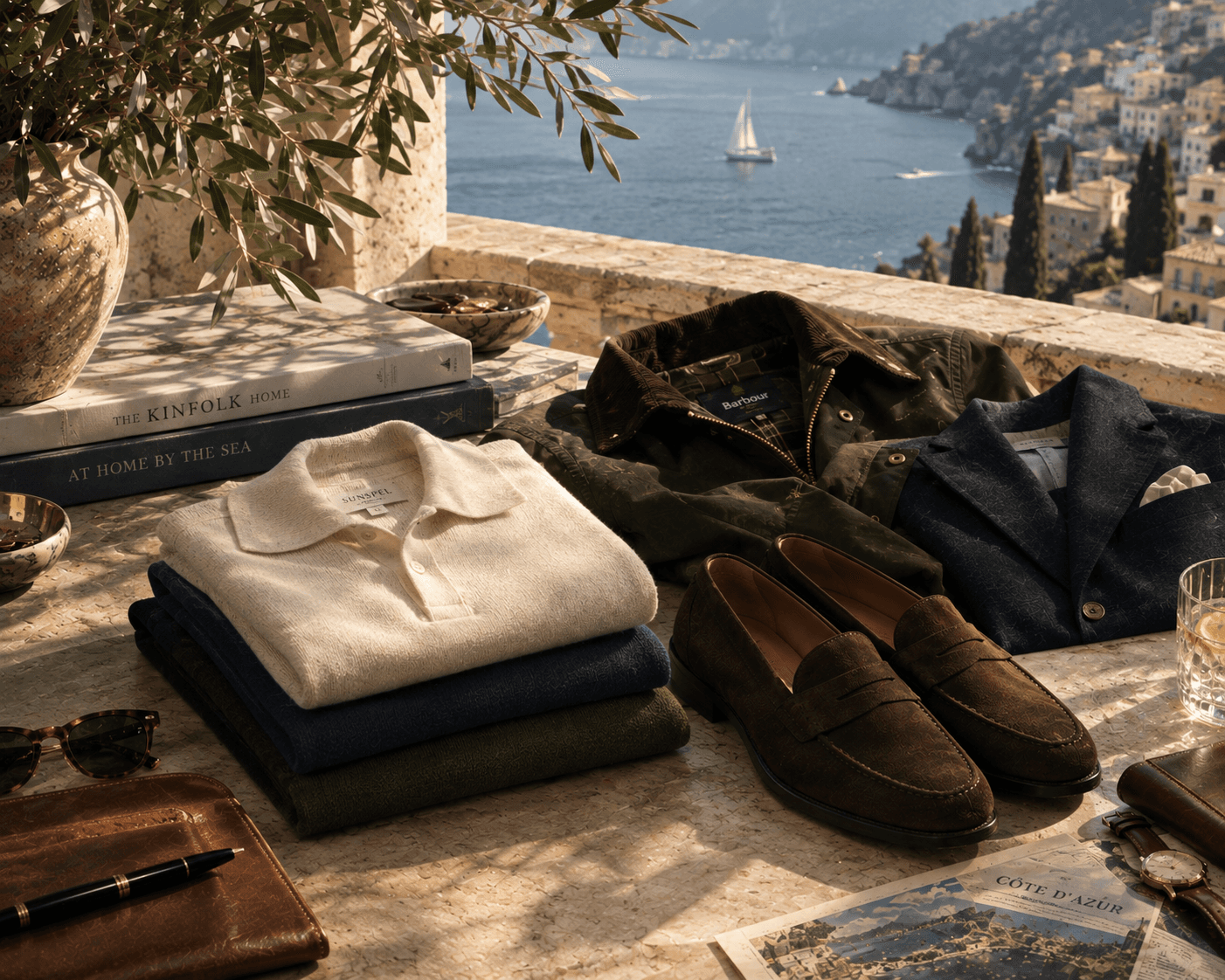
The Digital Interface
Discover More:

The Typeface Registry: 5 Classic Serif Fonts for Brand Design
By Blackthorne & Rowe | The Visual Archive
“A well-chosen serif typeface communicates structure and restraint far better than rapid graphic trends.”
In the realm of quiet luxury, timeless style is not just how you look, it is a lifestyle that you live. While much has been written about the drape of a heavy linen shirt or the shape of a vintage Ferrari, the true connoisseur knows that the heritage aesthetic is equally defined by its graphic restraint. This is the art of typography.
Old money typography relies entirely on historical roots and visual breathing room. It rejects the hyper-modern, aggressive sans-serifs that dominate tech platforms and fast fashion, turning instead to the classical proportions of historic European printing presses and architectural stone carvings.
If you are looking to build a brand identity or a personal work image anchored in this world, these five timeless typefaces offer the perfect foundation:
I. Caslon (The Heritage Anchor)
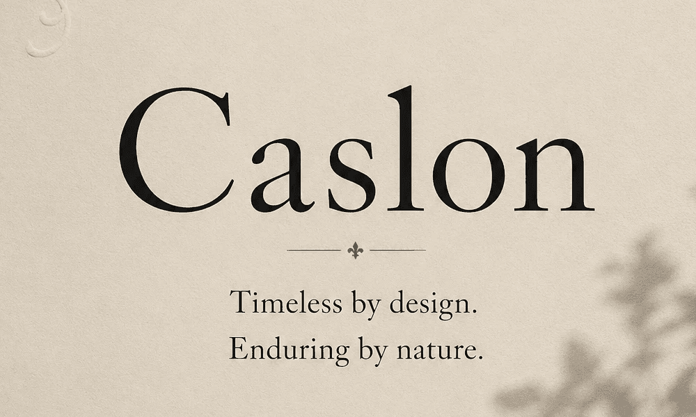
Dating back to the early 18th century, Caslon is the epitome of classic British institutional style. It is robust, highly readable, and deeply traditional. With its slight irregularities and sturdy stems, it feels less like a digital asset and more like ink pressed firmly into heavy, textured cream cardstock.
II. Bodoni (The High-Fashion Contrast)
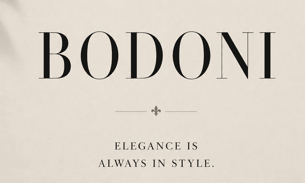
Characterized by an extreme contrast between thick vertical lines and razor-thin horizontal serifs, Bodoni is pure editorial luxury. It mimics the chiseled precision of Italian stone monuments. When typeset with generous spacing, it instantly evokes the heritage prestige of historic European fashion houses.
III. Garamond (The Renaissance Standard)
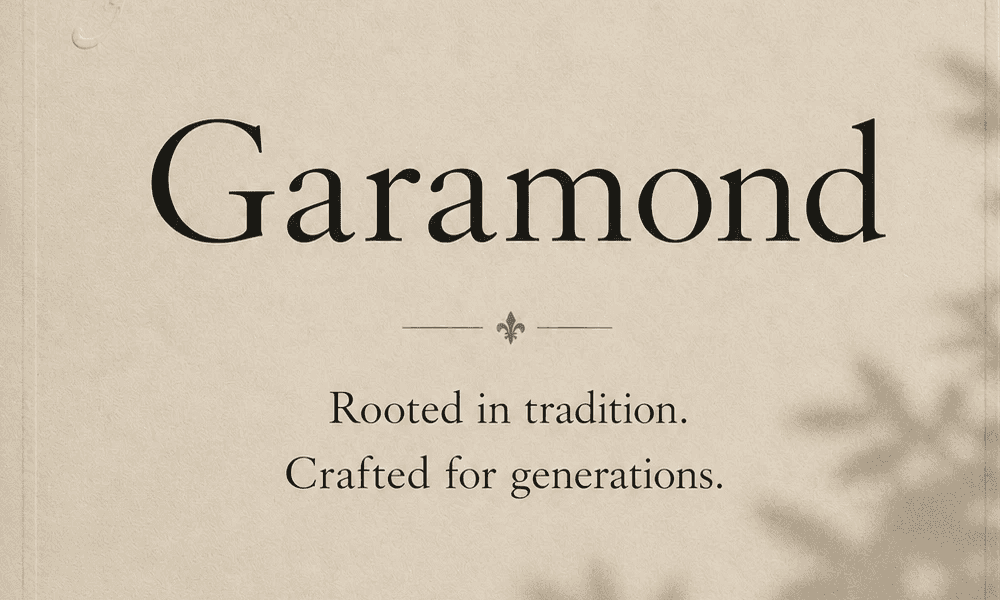
Garamond is all about organic grace and flawless balance. Its fluid, sweeping curves date back to 16th-century Parisian printing. Because its design is rooted in the natural movement of a scribe's pen rather than cold geometry, it brings an immediate sense of warmth, intellect, and effortless sophistication to the page.
IV. Trajan (The Architectural Monument)
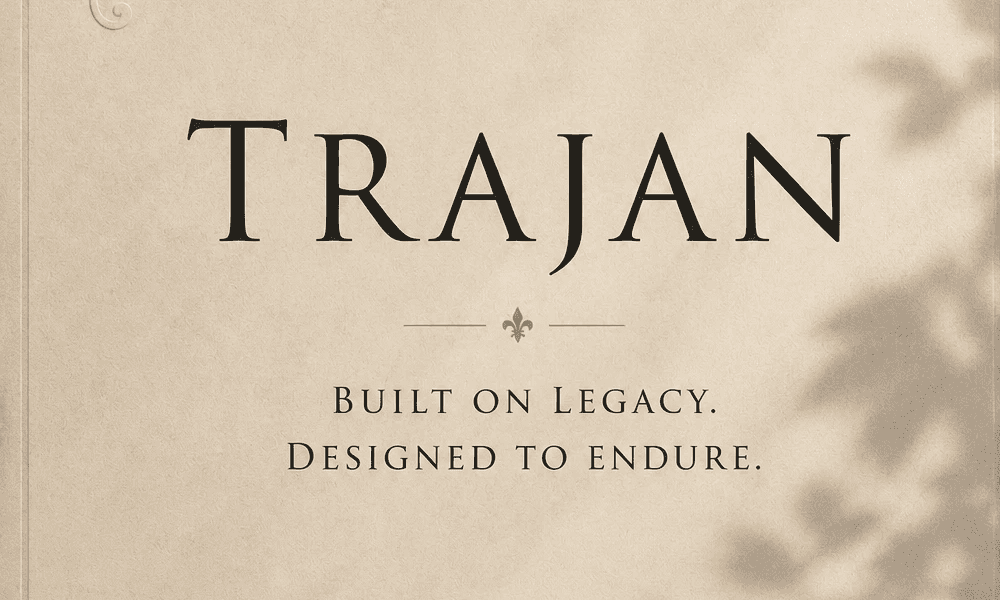
Based entirely on the chiseled inscriptions at the base of Trajan's Column in Rome, this all-caps typeface carries immense weight and permanency. It features no lowercase letters because it was designed for stone, making it the ultimate tool for creating authoritative, minimalist logos and estate headers that feel completely unshakeable.
V. Baskerville (The Disciplined Transitional)
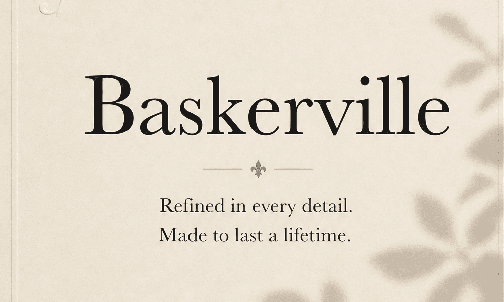
Baskerville represents an era of mid-18th-century refinement and intellectual clarity. It sharpens the soft edges of earlier renaissance fonts, offering crisp lines and deliberate geometry. It is neat, perfectly organized, and commands respect without ever asking for it—making it the ideal choice for an understated, intentional layout.
The Secret is in Space
Ultimately, choosing the right typeface is only half the battle. The true old money aesthetic relies on kerning —the art of wide letter-spacing. Giving your characters room to breathe communicates an effortless confidence. It tells the viewer that you have the luxury of time and space, demonstrating a strict discipline and a deep respect for timeless design principles over fleeting visual trends.
Continue Through the Archive.